bigpixel
* data visualization and product design
Fund Dashboard
Design of an internal dashboard where employees can find everything they need to know about a fund. The dashboard provides both a high-level overview and details about the fund's characteristics and metrics.
TARGET USERS
Sales Consultants and Product Strategist. Sales Consultants need to get information quickly while on the phone trying to sell a product to a financial analyst. A Strategist needs information in more detail to compare and position the fund.
DEFINE
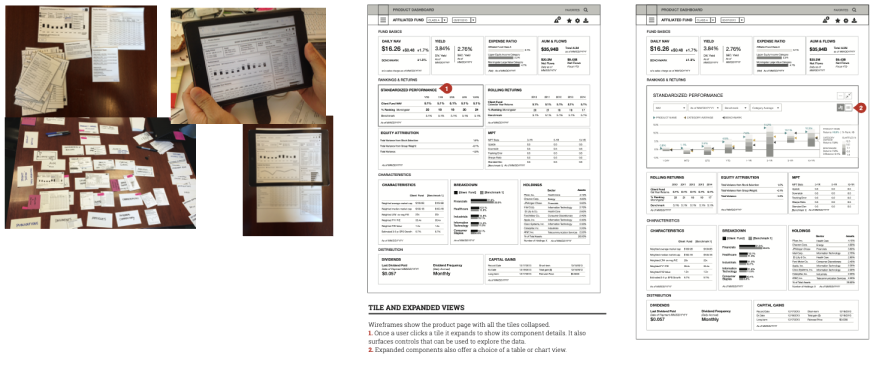
An initial set of wireframes was created based on the business requirements. To validate the component content and information hierarchy, we created paper prototypes and conducted card sorting sessions with different user groups.Once the hierarchy and layout was defined, we created Invision prototypes for early user testing.
DESIGN FRAMEWORK
One of the biggest challenges in this project was to fulfil the goals of two different groups. For Sales Consultants, it is important to get information quickly about different metrics. Strategists need more detailed information about some metrics, which varied from product to product.
INFORMATION AT A GLANCE, DETAILS ON DEMAND
The design principle is to display the full variety of information available at a glance, using tiles that can be expanded to reveal deeper detail.Customization thereby becomes a painless process. When users return to the page, they are presented the dashboard in the state they last left it.
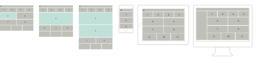
RESPONSIVE APPROACH
From a device perspective, only the Sales Consultants are expected to use the product dashboard on mobile and tablet devices. User research informed us that when displaying the dashboard on these devices the information available in unexpanded tiles was enough to cover their needs.
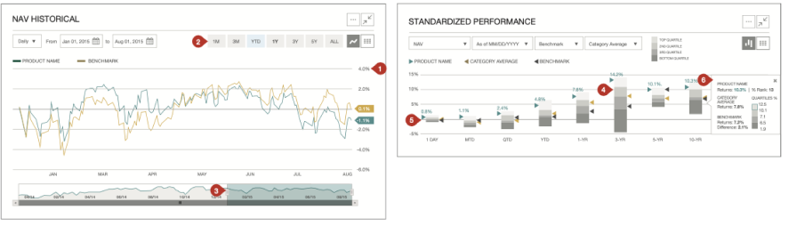
HISTORICAL PRICE CHART & PERFORMANCE AND RANKING CHART
Design and interaction details for a historical price chart and ranking charts: